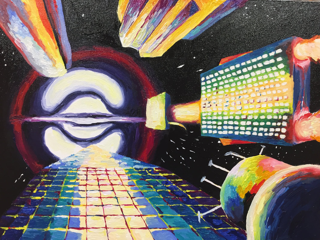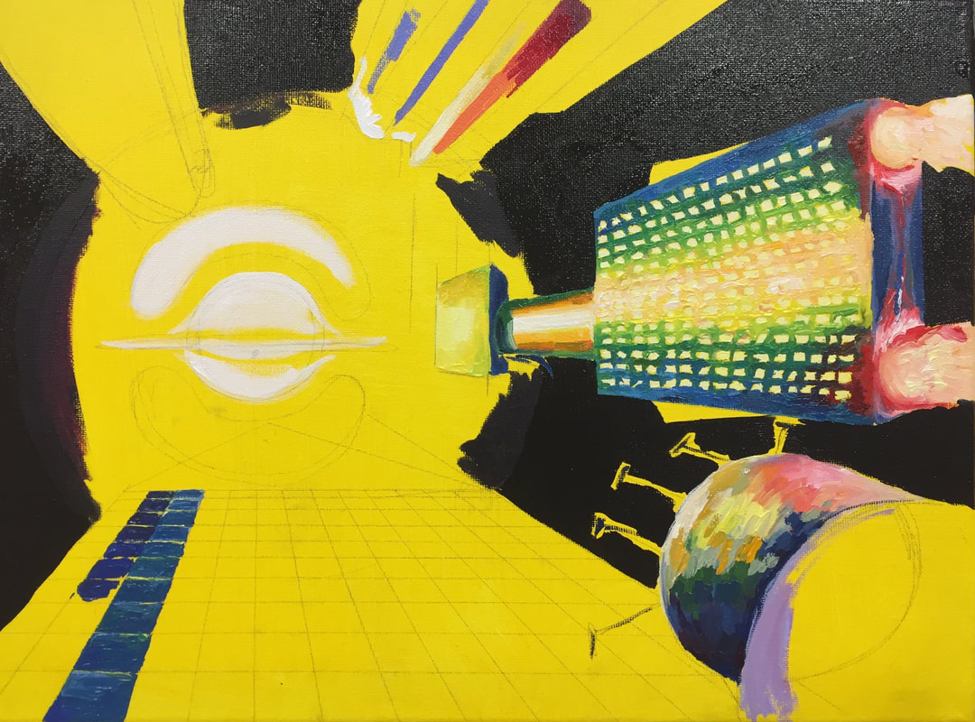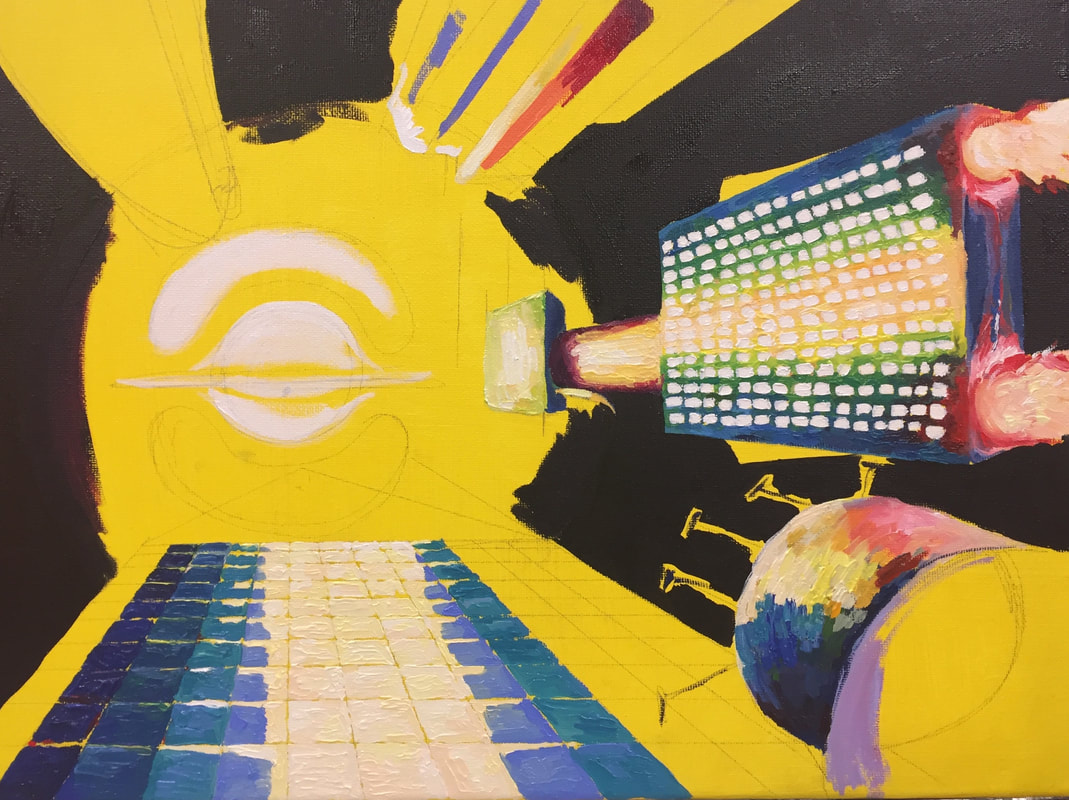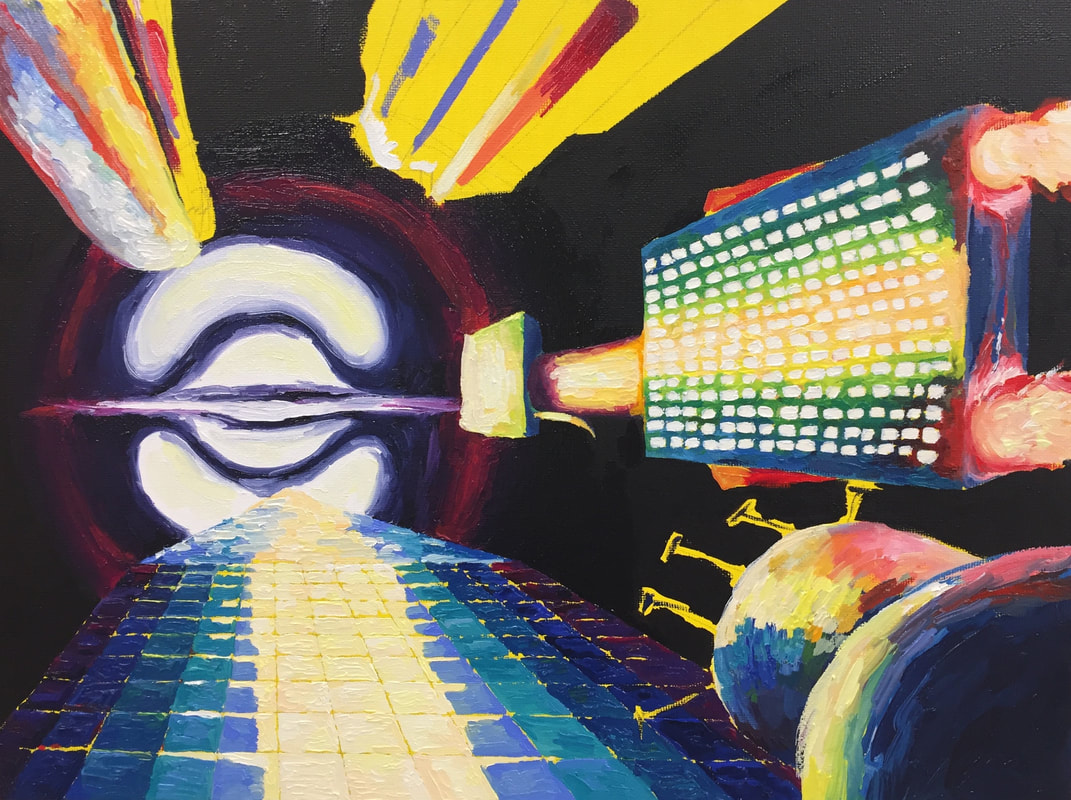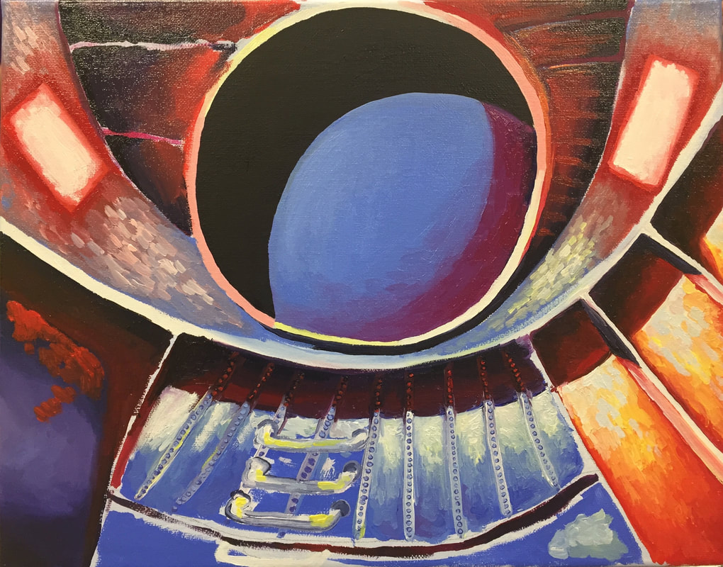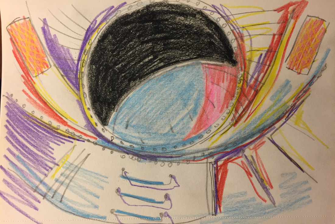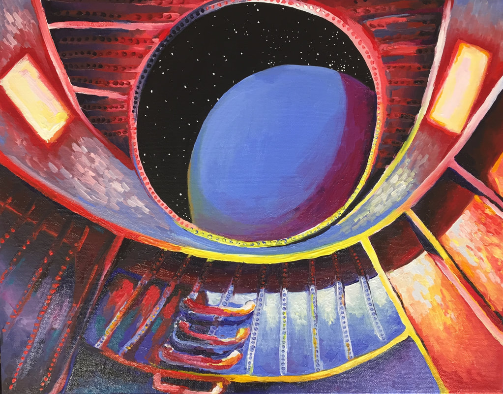
This piece was originally going to be an exploration of shape and composition, forming the interior of an imagined space station. It ended up being an exploration of my favorite painting subject: light and color. I gave myself a limited but vibrant palette to work from, keeping it fairly simple so as to not confuse the image or make it even busier than it already was.
This piece could have been planned much more effectively. It was definitely one that I had to figure out as I went along, looking at the work so far and deciding what changed needed to be made so that the lighting made sense. As I said, lighting is one of my favorite (if not my ultimate favorite) thing to explore in art. I like to experiment with the way different colors and intensities and locations of light sources change the way a piece looks. Still, four separate light sources (the white-yellow light of the sun from off screen, outside the window; the two dull red rectangle lights in the wall; and the ambient light theoretically reflecting off the surface behind the viewer) was a lot to handle, even for me. I think I did a decent job handling the way the shadows would be complex and not-flat in that sort of lighting, but I think I could have benefitted from a reference. One aspect of this piece that I really liked was the bolts in the wall. They were fairly simple to paint, with a few layers each of appropriately colored paint in different values overlapping gently to create just a tiny, subtle little bump. The bottom left and center of the piece were the regions that were the most frustrating and difficult to get right; figuring out the balance between light and shadow for the bottom left was hard. I wanted it to be light enough so that it wouldn’t be jarringly dark against the rest of the piece, but still dark enough that it was clear that the sun was definitely shining in the other direction. Purple, which I had used sparingly in the piece, was definitely helpful with this. Since it is the compliment of yellow, the color I mostly used for the sunlight, the contrast between light and dark was more clear since it had the extra weight of a complimentary color contrast. 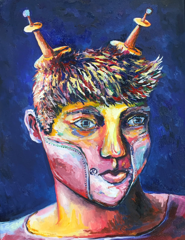
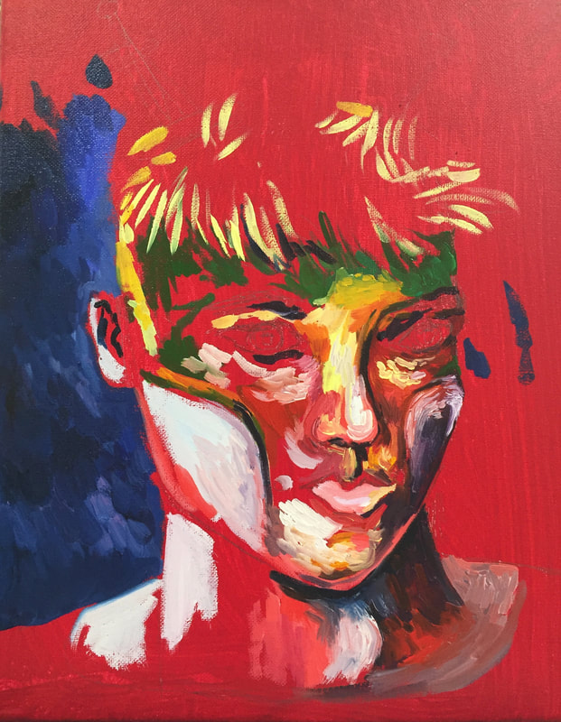
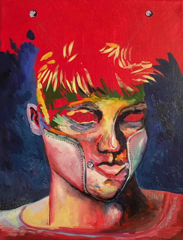
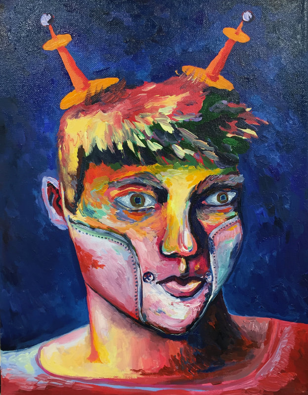
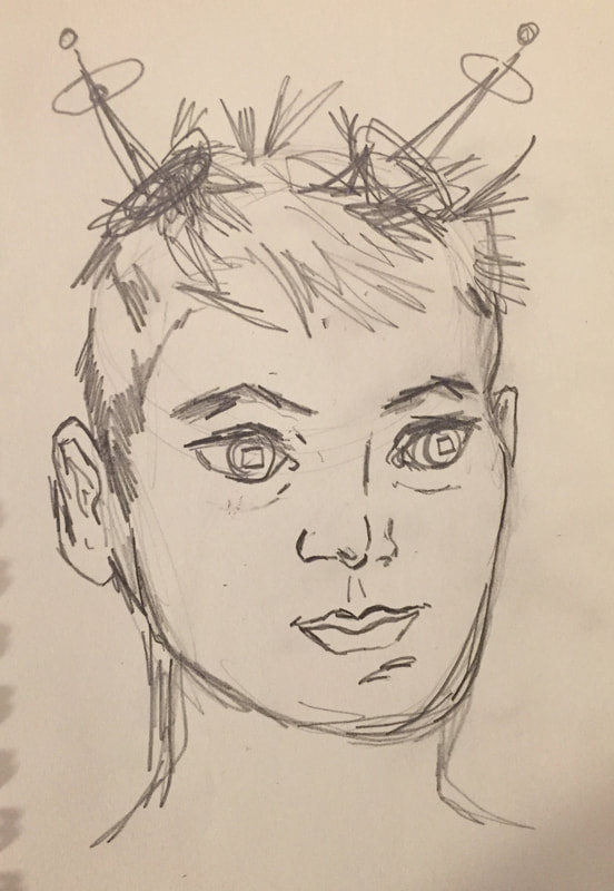
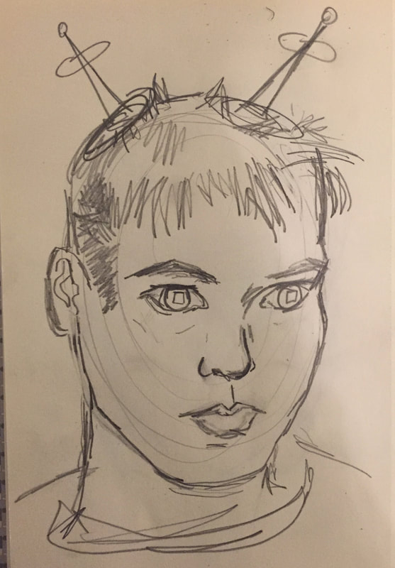
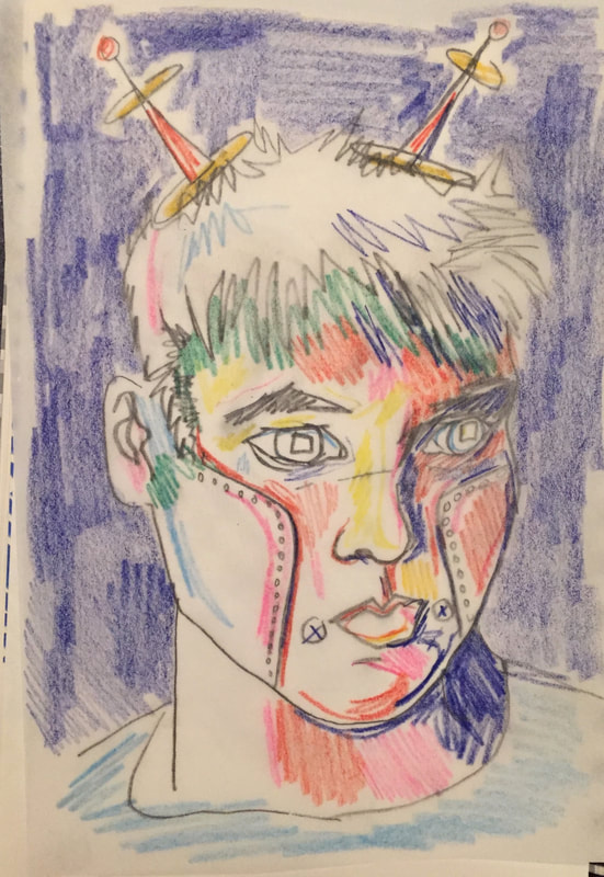
One of my favorite tropes in science fiction is the AI/robot character. It’s often used as a way to explore concepts like emotion, identity, and what it means to be a person. For this project, I wanted to explore that trope with a self-portrait, using it as a frame through which to view myself.
I wanted to contrast playfulness and whimsy with the rigidity of a machine. In order to achieve this, I chose to use a generic left-facing portrait pose, keeping my face in a neutral expression and adding a dark blue background. I deliberately chose to use very bright, unnatural colors and augmented my portrait-self with two space-age-esque radio antennae. The serious expression combined with the antennae especially feels absurd to me. This is also part of the appeal of science fiction stories: often, they delight in following an absurd idea through to its conclusion, ultimately revealing something about the real world. The science fiction story implied here is one of these cases. This figure, even while rendered in rich and fun colors, with radio antennae on its head, still takes itself seriously. There is something to be said here about the nature of being a teenager, here, I think. There is some deeply fundamental truth about how being a teenager is absurd as an experience, and even as we know this we still have to take ourselves seriously; sometimes it takes a while to realize the absurdity. Take this painting as an example. I was already nearly finished when it occurred to me that giving myself radio antennae on my head was pretty silly. The earnestness with which I rendered my robo-self combined with the self-conscious irony with which I am writing this really speaks to the contrast of seriousness and silliness within the actual painting: in that respect, based on that measure, I think I’d consider it a success. There’s layers of irony in drawing one’s self as an emotionless machine while using an incredibly intuitive, impulsive, and emotional method for picking the colors. My idea of the main color regions of the piece stayed largely the same from my final sketch to the finished piece, but I decided the details as I worked. For example, the eye sockets were mostly rendered by looking at my palette and using whichever color was currently available that had the value I was looking for. It contains red, blue, green, purple, orange— I adjusted as I saw fit, and I changed it based on my mood, eventually coming up with something I was satisfied with. I enjoyed this process, and I think the idea of it makes for an interesting conceptual combination with the subject matter. |