|
I grew a lot over the semester. When the semester began, I hadn’t taken an art class since freshman year. I hadn’t painted with watercolor since Elementary school. And I had never tried oil paints.
I came into this class with a pretty decent grounding in color theory-- color has always been one of my favorite things-- but even so, I learned a lot during this class. I learned how to layer and mix colors in each medium, and that (conversely to my previous assumption) adding white or black to the paints used in a piece can actually help create more subtle variation in color. I also figured out how mixing different pairs of complementary colors can create browns or greys with different undertones. I also learned a lot of new techniques and ways to move the brush on the canvas. I learned how to blend, and I also learned how to create texture with the brush. I learned to like round brushes (before I pretty much only used square/flat brushes) and vary line weight with them. Overall, I think it was a successful semester. I am excited to continue to make art in class next semester.
0 Comments
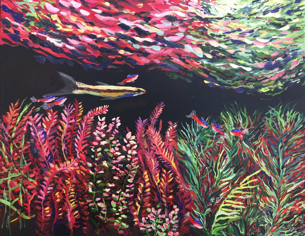
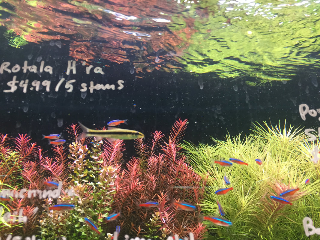
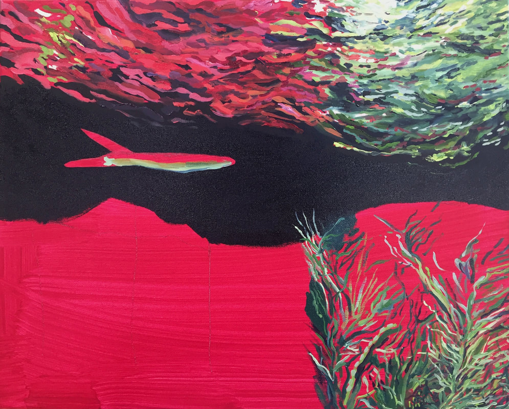
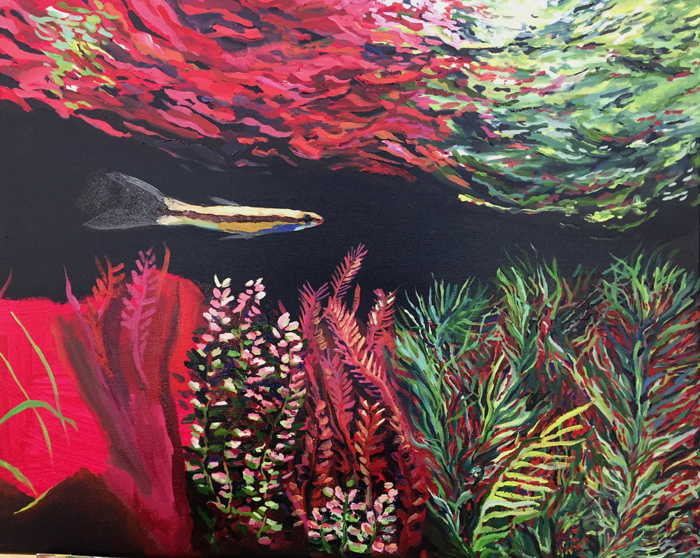
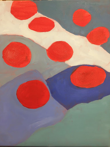
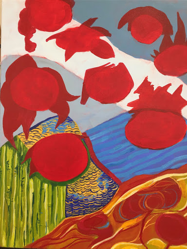
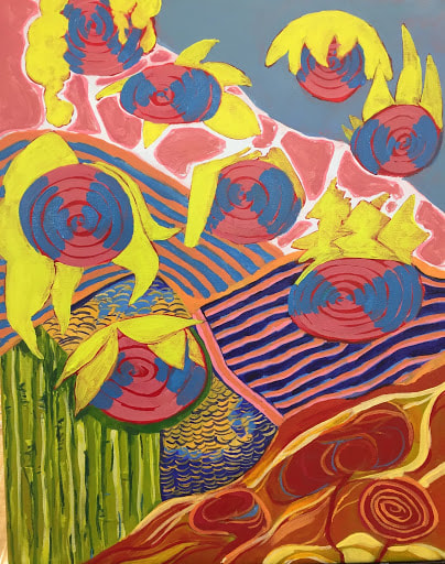
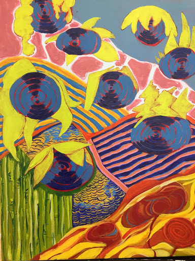
This piece was one that I had wanted to paint since the beginning of the semester. Over the summer, my brother and I went to a pet shop that specializes in fish, and I ended up taking a lot of photos, just because it deeply mesmerized me. The contrast in both color and value is what makes it an interesting image for me. Also, even though the composition can essentially be broken into three horizontal stripes, each region contains a lot of movement, keeping the painting from looking completely static.
After priming the canvas with red paint (I considered black, but wanted the paint to be able to stand up to whatever I painted it on, and I wanted to make sure I had full coverage in the black region in the middle of the painting) I started with the reflection of the plants in the rippling surface of the water. This is what looked the most like a painting to me, and I wanted to try something less precise. I achieved a rippling effect by using a large round brush to streak the surface in little arcs and wiggles, changing the hues and values of the red and green areas to show the change in light. After a while, this got tedious (honestly, I just got bored mixing various different colors of red that ended up looking mostly the same on my palette), so I switched to the water plants. The green plants with thin leaves took a couple days. It was definitely worth it for me, though. Because of the way I layered, I managed to give the impression of separate plants without keeping them on the same plane or sacrificing depth. Using lots and lots of thin lines with different variations of color, keeping them somewhat directionally organized for each plant, and then filling in the gaps with a dark color when most of the canvas was covered was a technique I wish I had known back when I did the textured oil landscape piece. If I had done something similar in the foreground, I think it would have improved the grass closest to the viewer. I am glad I figured out that technique early on during this piece, though, because it kept me moving through the other plants, which seemed frustratingly fiddly at first glance. For the red, fern-shaped plants, I first blocked in vague areas where I predicted each leafy stem to end up, then worked fairly randomly, jumping from area to area and approximating the shape and color of the plants I saw in the photo. I defined the edges of the small leaves by highlighting them with light yellow and/or purple and dividing them with a dark blue I mixed from indigo, phthalo blue, and black. This ended up creating a layered effect again, and gave the impression that plants in the background were fading into the shadows. I did something similar for the pink and green plants, but I started with light pink and light green ovals for the leaves and then connected them into plants, shading each individually. The fish were last, and those were pretty intuitive and impressionistic: I separated them into shapes of color, and then filled in these shapes on each fish. The fins were rendered with extremely thinned out white. Finally, I noticed that there was not enough color variation, so I added yellow and blue for shading and highlighting. 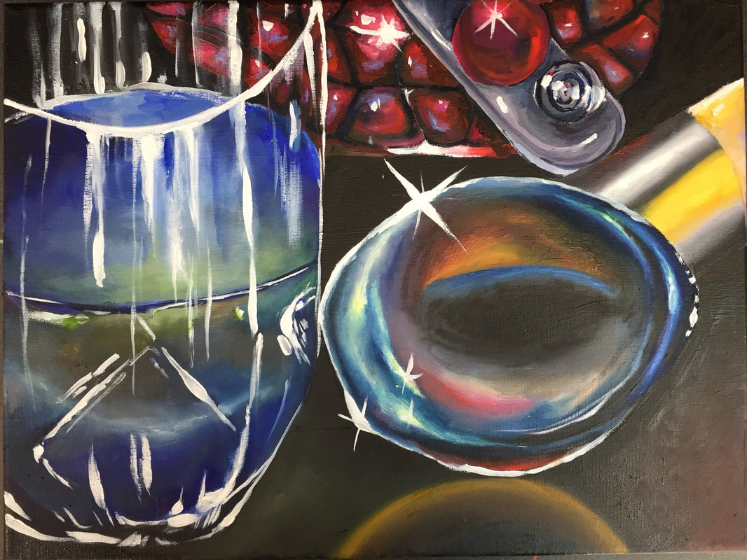
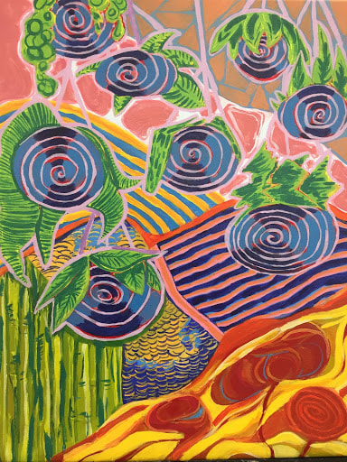
This project was one that I think had some interesting successes, but there are also aspects of it that I am not entirely satisfied with. Still, this project taught me a lot about painting.
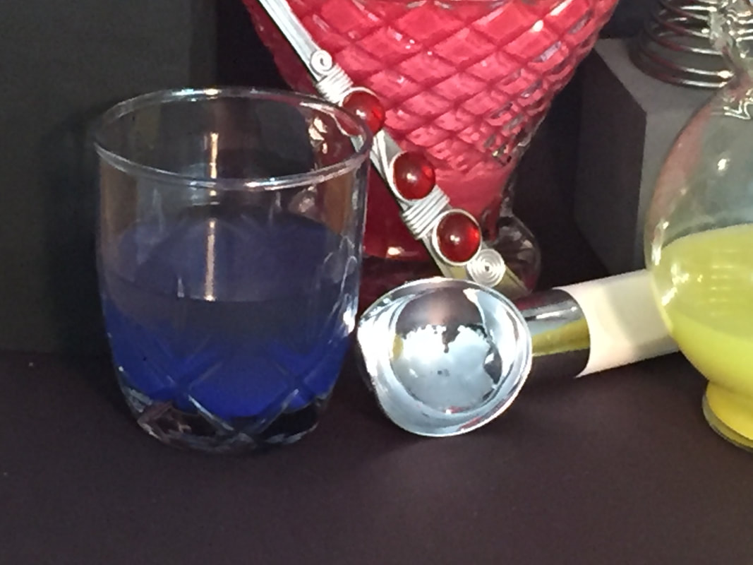
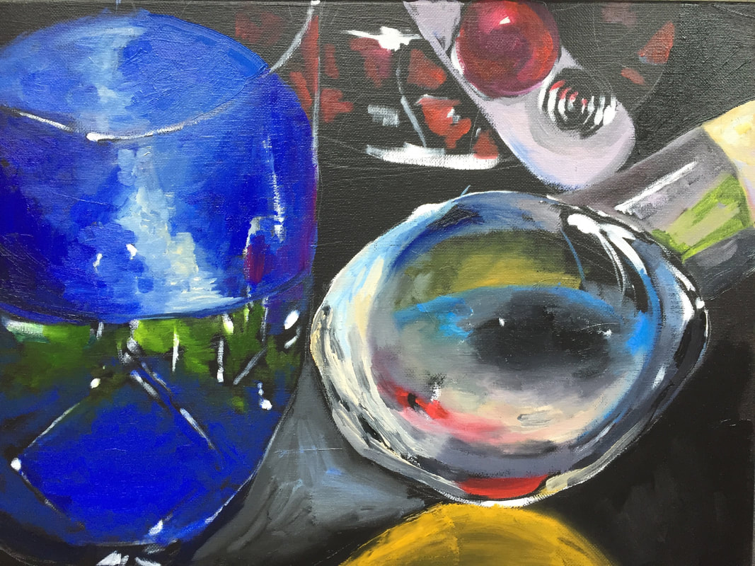
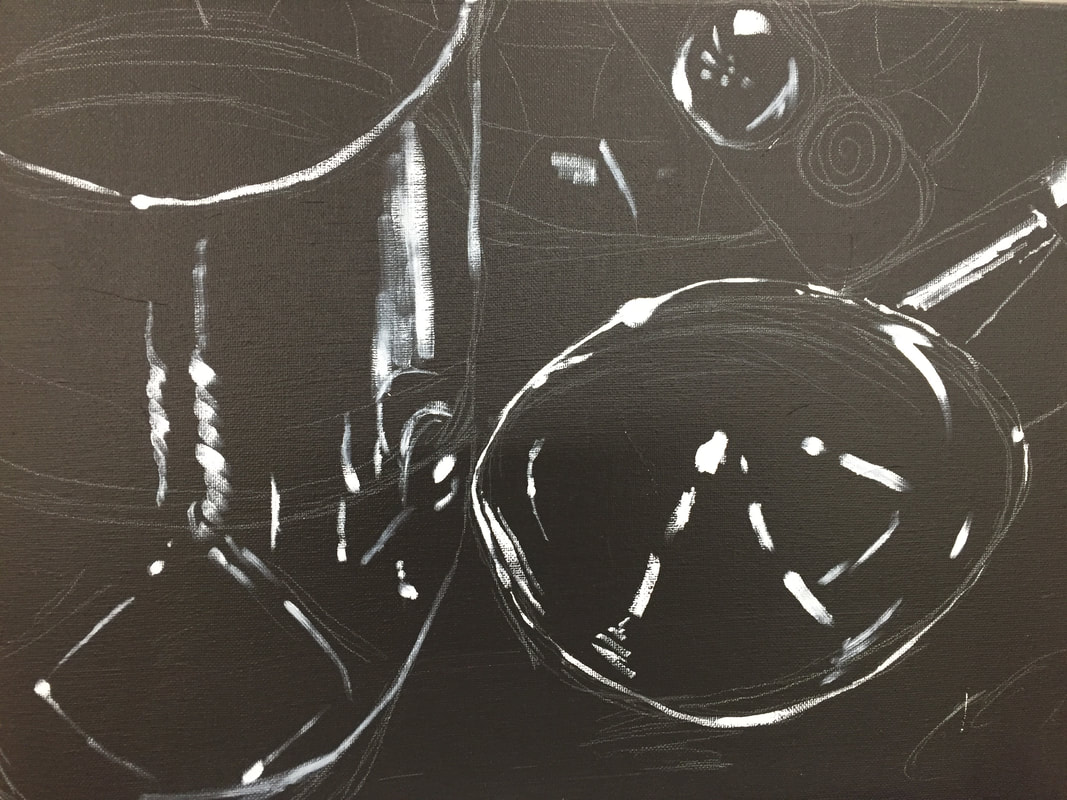
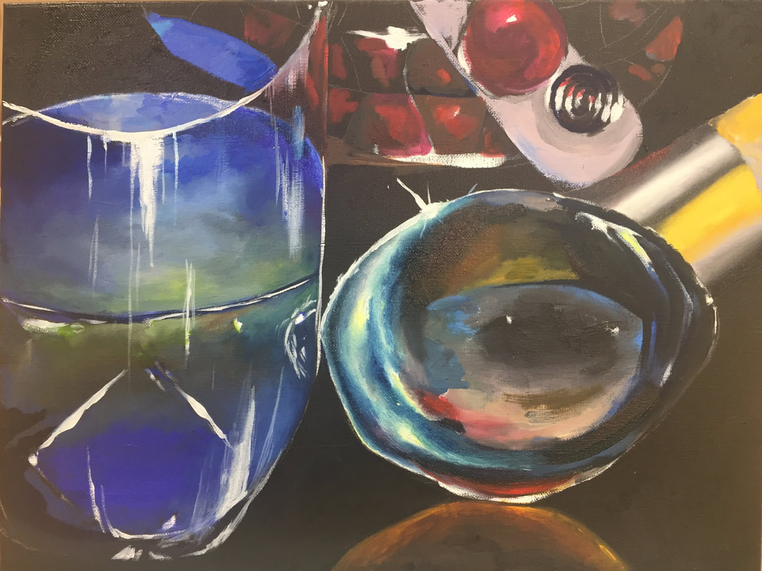
To begin with, I outlined my composition with white paint, planning the places that should have the brightest shine. This was definitely a good idea to begin with. However, I think I could have spent more time making sure the sketch was right and that the proportions/perspective of each object were correct. The glass on the left ended up looking warped because I sketched from life on two separate days, and I was standing in a slightly different position on the second day. Next time, I would make sure to stay in the same spot and finish the whole sketch all at once. If the skeleton of the piece is off, it will make everything else look a little off, too. I do like how I varied my line weight by using a big, thick round brush and changing the pressure of each mark. My process from there was to block in the colors, adding variation and depth as I went. Eventually, I noticed that the glass was warped, and had to fix that by waiting for the oil paint to dry and then painting over it. In fact, the glass was definitely what got the most adjustment and work throughout the piece: I experimented with different methods of mixing the colors I needed, starting with just white and ultramarine to make that beautiful bright blue, and ending up mixing in other colors (phthalo blue, brown, and yellow) to show the way the water in the glass was greyer near the surface where the pigment within it had settled. The depth of the colors in the water, as well as the shine and texture on the vase filled with red water behind it, are probably my favorite parts of the piece. Once I was finished blocking in and detailing each color, I added the highlights, going back in with white (which I thinned with Liquin to make it slightly translucent). I added asterisk-shaped shine marks on the areas I wanted to shine the most in order to create a sense of whimsy. If I was to redo this painting, this is another place I would spend more time, making sure to use more than just white for the highlights. Although I did use color (like the light blue on the red vase) to highlight, I think it would have emphasized the reflective properties of the subjects if I had spent more time picking up on the surrounding objects in the highlighting. I also would have darkened the middle of the ice cream scoop in order to increase the contrast. Overall, this piece was fun to use as a place to experiment with color and light. It taught me a lot of things that will help with future paintings, even if I don’t consider it my most successful painting.  For this assignment, I painted a glass jar. I began with the highlights (using white) and slowly added more color.
1. Describe the craftsmanship of your painting. (Is it neat and well executed?)
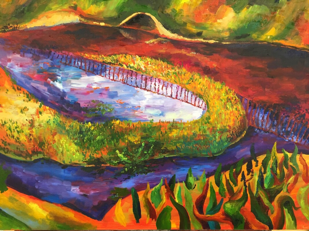
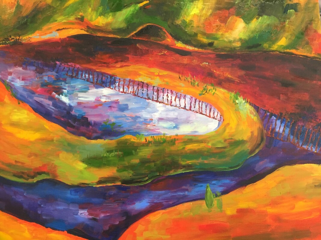
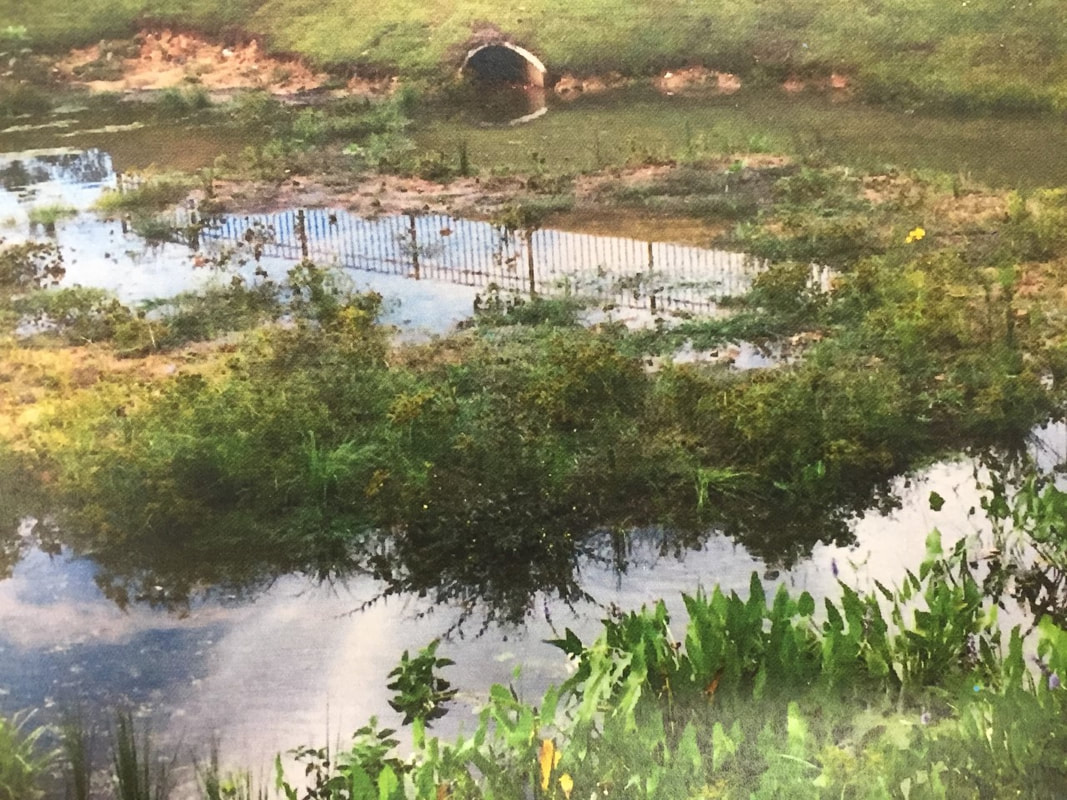
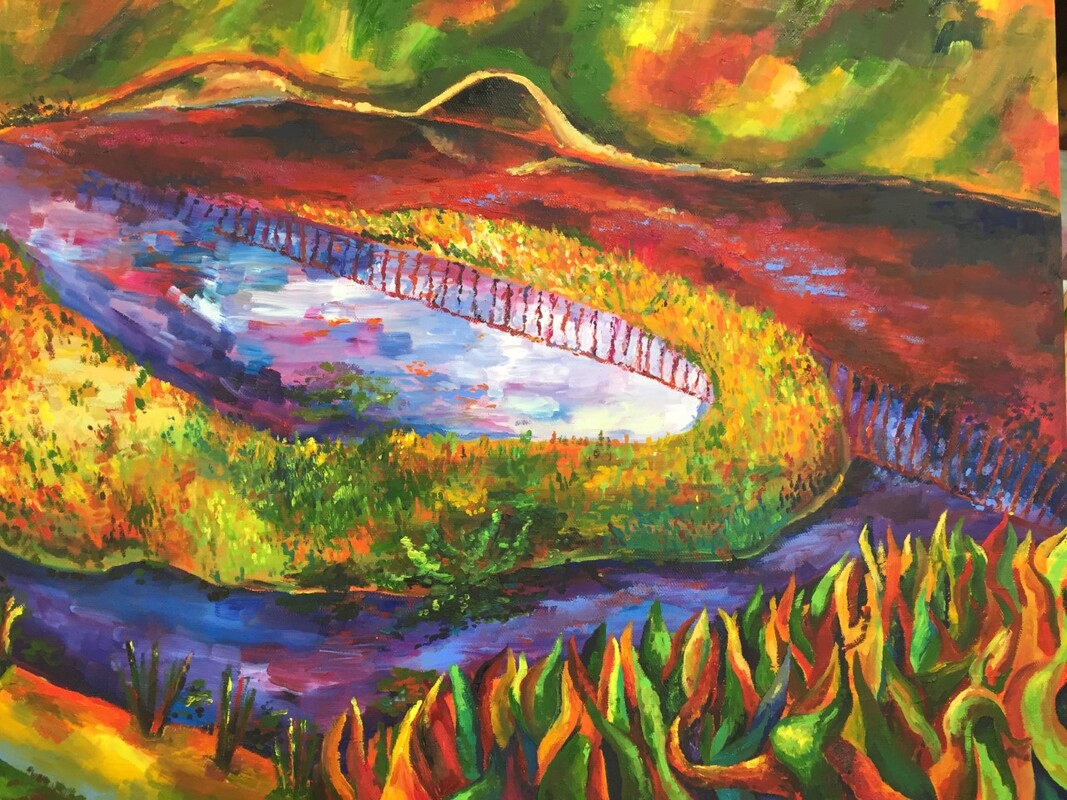
The painting is neat. I used precise brushstrokes, often with a small brush, to create texture. The color harmonies and interactions were carefully considered both within their relative regions of the work and in the context of the painting as a whole. I also was careful to differentiate the reflections on the water from the actual objects within the piece. The reflection of the railing, for example, is not rendered in solid lines, but rather in dots and splotches to imitate how reflections are distorted on rippling water. 2. Describe your choice of colors/color harmonies and how you used them throughout the artwork. I worked from a photograph, but changed the colors drastically from the original reference image. The original was almost entirely green and brown for the land and foliage, and blue and brown in the water. I kept some of the blue and green, but also added red and yellow to the palette as dominant colors. This was to give the piece some additional color contrast and make use of complementary color pairs, mainly red and green. The warmer colors and the use of yellow to depict light on the plants gives the piece a more invigorating feeling than the original tranquil but sad photograph of a glorified puddle. 2. How did you create contrast in your painting? One place with a lot of contrast is the water, which is blue, red, orange, and magenta. I chose to add red to the water where shadows fell because I liked how, in my reference, the water changed color when it was reflecting the sky versus when it was not. I chose to make that contrast more extreme by manipulating the colors to add more visual interest. There is also orange in the light blue, sky-reflecting region of the water to show that the water was not entirely clean, and also to brighten the blue next to it. The wide variety of colors used that are not typically associated with water add a sense of human manipulation and couple playfulness and unease. The contrast between the pink and light blue in the bottom stream of water looks lively and fun, whereas the red of the shaded water next to the yellow and green of the plants makes that area look sickly. These elements balance each other out to create the feeling of my final piece. 3. How did you apply textures, highlights and shadows to enhance your artwork? I did not use black paint in this piece, and tried not to use white paint. Instead, to shade, I used red, green, and dark blue. To highlight, I used yellow, magenta, and light blue. This gives the piece a saturated appearance. The textures were also a fun part of this piece. The grass looks soft to the eye, whereas the water often has a rougher appearance, especially on the left. I wanted to create a variety of different effects with my paintbrush by choosing to blend my colors into their neighbors or leave them in unblended to create contrast. 4. How were you able to create depth in your painting? I used perspective to help define the foreground, midground, and background. The grass in the foreground is large and each leaf is rendered with lighting and shading. The midground, the little island in the middle, has much less detail on each individual blade of grass, since it’s further away and smaller. Individual strokes of a paintbrush defined several blades of grass at once. The background is almost devoid of the texture of individual blades of grass, instead relying on much vaguer texture, and color/context clues, to give it the appearance of grass. This gave my piece depth by defining the distance of each region from the viewer. 5. What painting techniques did you use that made your painting successful? I used a lot of layering in this piece. I did not use any liquin, so the paints are all in their original relatively opaque state. In order to create the rich and complex colors in the grass, I placed down increasingly sparse layers of paint, allowing the lower layer to show through while adding new detail and color with each pass, letting the paint below change and add nuance to the new layer. I had a different approach with the light blue section of the water, which was largely painted all in one layer, all at once. I added a different color of paint to my brush almost with each brushstroke. This built up layers of color on the brush, meaning that each stroke was not a blended, homogenous shape, but instead a complex animal with different shades and hues in each stroke. This created a dynamic effect for the water. 6. Describe any difficulties you had creating your drawing and what you could do to improve your drawing? During critique, the grass in the bottom right corner got compliments for its colors. However, I think I could have improved the form and texture. It ended up very stylized and unrealistic, like strips of fabric rather than grass. In the future, I would have created more variety in the basic shape of the blades of grass instead of making them wiggly triangles. I also would have clumped the leaves together into little chunks, creating the effect of plants with multiple leaves rather than evenly spaced, single leaves. 7. Explain the successes you had with this painting. In my opinion, this painting was successful. I enjoy using bright colors and working with thicker, heavier-bodied materials, which worked for this textural painting. The composition was definitely part of the success of this piece as well. It made use of strong diagonal lines heading all the way across the canvas, overlaid by a swirl. This is a dynamic combination of shapes and definitely part of what makes the piece work. It directs the eye over various paths across the piece, rather letting the viewer’s attention wander aimlessly. 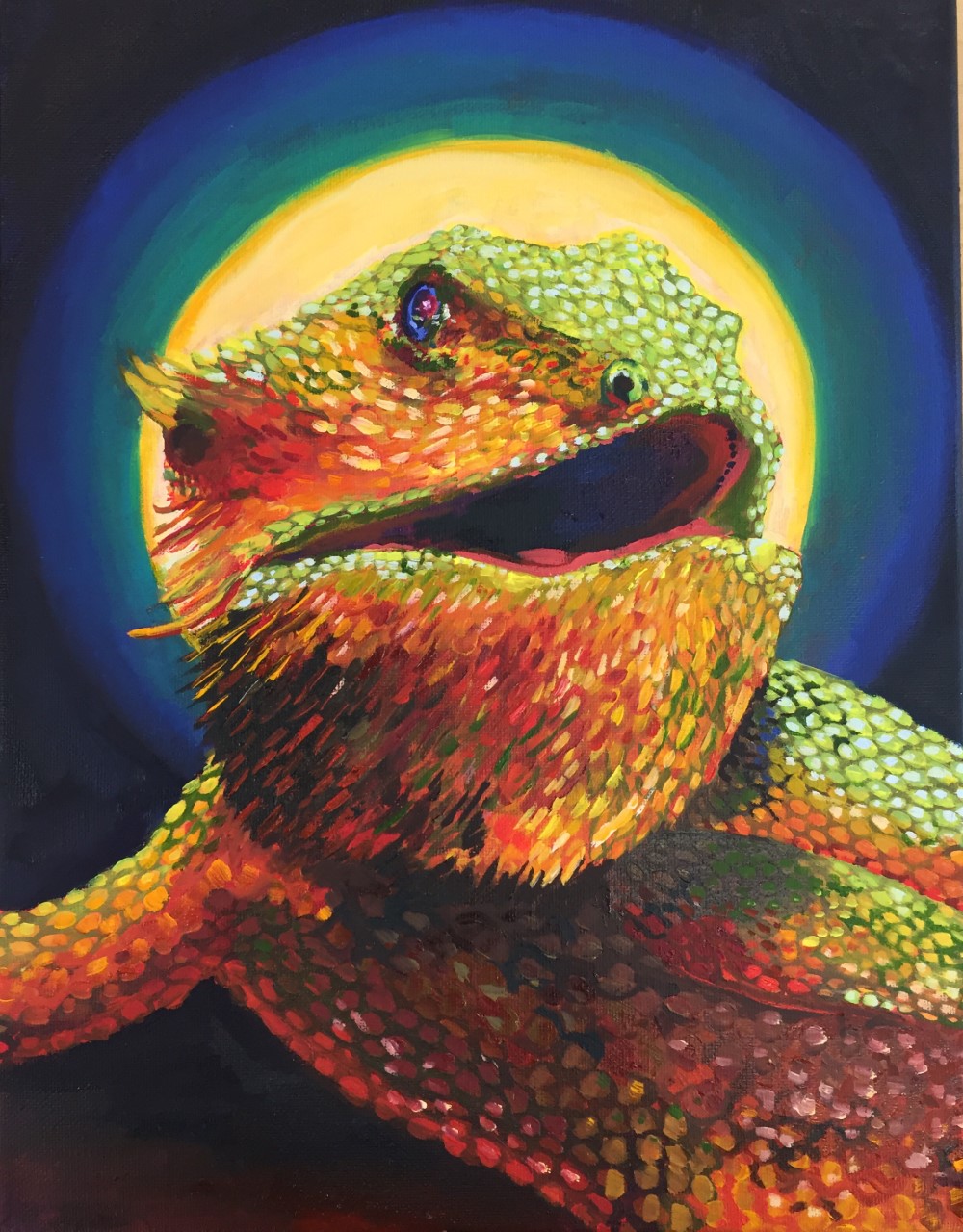
1. For this critique I first want you to discuss your painting. Use your own words to describe, analyze, interpret and judge your artwork. Add art vocabulary to make your critique better. There are no questions to guide you so you need to be as in depth as possible.
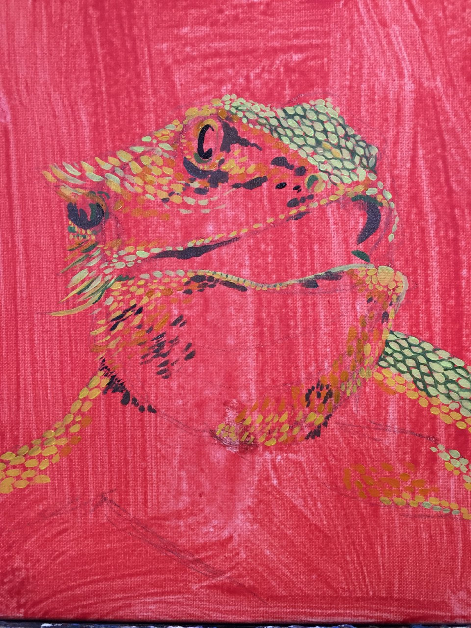
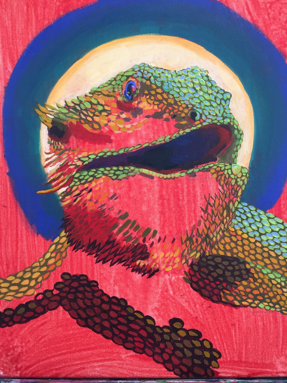
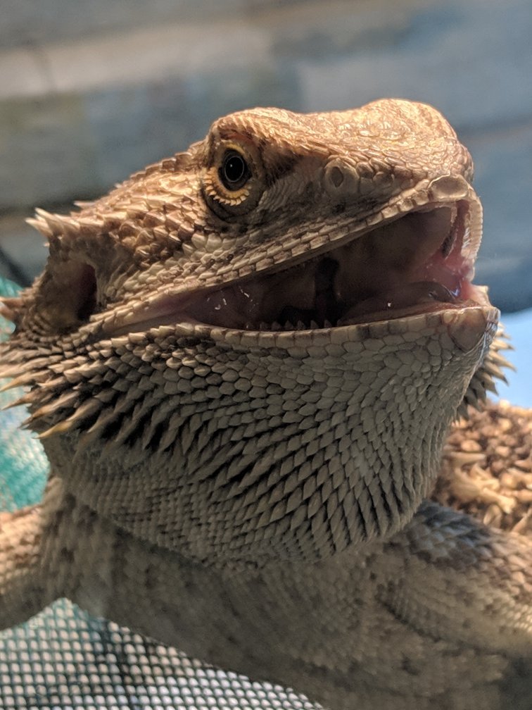
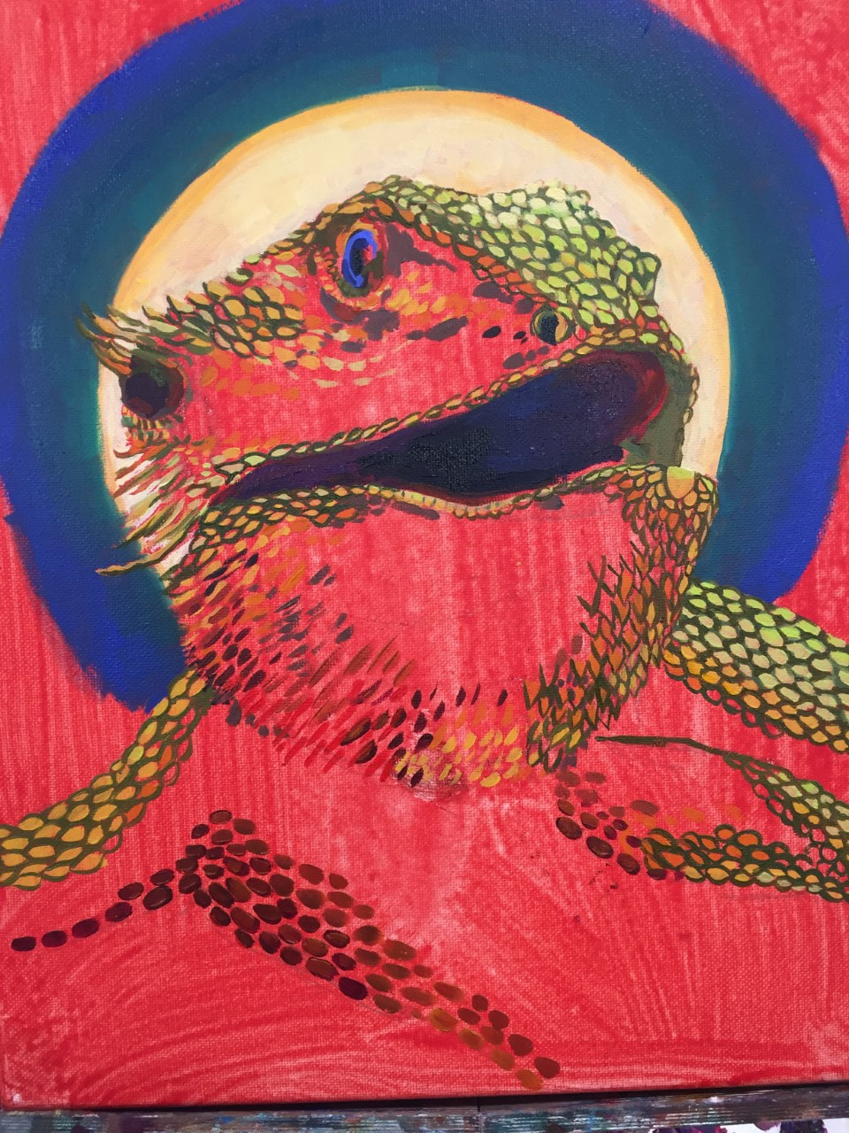
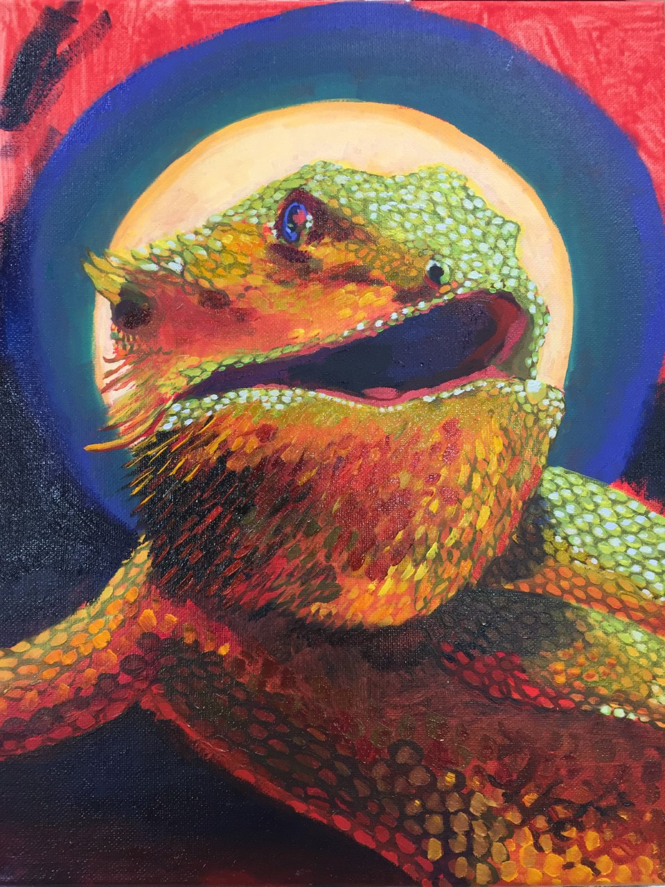
The painting is a stylized but semi-realistic portrait of my friend’s lizard, Stinky. I used a rich, jewel-toned palette to lend a regal appearance. This, coupled with the point of view of the piece-- the eye is below the chin of the lizard, making the lizard seem taller and more important-- and the medieval-religious-art inspired halo behind his head gives Stinky an air of power. The scales point to the open mouth, the central point of the piece, and also the most dynamic aspect of the composition. Stinky can be imagined as a prophet or king speaking with some sort of wisdom, most likely “mealworms good to eat,” or other similar bearded dragon advice. 2.Discuss how accomplished value, texture, layering, blending, contrast and realism. What is the most important aesthetic quality of your painting? If you are unsure what aesthetic means then look up the meaning and write it with your critique. I used color, rather than black and white, to achieve value. Different shades of red, yellow, and green created an impression of light reflecting on the subject. To shade, I used van dyke brown combined with phthalo blue in various proportions. The almost-black this achieves is richer and more complex than plain black paint, adding warm or cool undertones depending on the relative temperature of the surrounding colors (it is cooler than red but warmer than cobalt). The scales themselves show different aspects of layering, blending, contrast, and realism. My original scale technique, which made use of many layers, can be seen best on the lizard’s back, where the following layers were used: 1) blocking of individual scales; 2) outlining the scales in a darker color; 3) touching up the shape of the scales; 4) highlighting with yellow; 4) a glaze over the whole thing to unify the colors; 5) shading in light blue; and, finally, 6) detail work using much darker green between the scales to create extra depth and shading. The glaze to unify colors also shows blending. The lizard’s bright colors contrast with the dark background so Stinky really pops out. And the form of the scales-- the way they follow the curve of the lizard’s body-- helps create realism. 3. Explain your creative process. Discuss how you used techniques learned in class to create a successful painting. I originally had a long, convoluted process planned to paint the scales. It looked great on my practice canvas paper, since I only had a few scales to paint and rendering them individually wasn’t super time consuming. When it came to the actual painting, however, I had to switch techniques halfway though. The scales were taking forever, and the effect was rather flat and cartoonish, so I started using a glaze technique, making the paint thinner using liquin rather than applying the paint in its original opaque state. I was able to create a more impressionistic, rather than graphic, effect. I often also ended up painting the base the color between the scales, then simply adding scales on top of that all at once, as seen under the lizard’s chest. To maintain depth, I did not fully blend the paint on the brush, keeping the scales I painted this way from being one solid color, and I did add some highlighting on top. 4. Reflect your growth through the project. Before this project, my tendency was to rely on heavily saturated neon colors. I did not make use of many neutrals. However, for this project, it was much more difficult to work using an overly bright palette. The lizard I painted is a dull sandy brown in real life. There were also not many color cues from my reference photo to exaggerate-- for example, there was no dramatically colored lighting to pull from. Instead, in order to achieve any recognizability as the actual animal, I had to learn how to blend and use complex neutrals by mixing colors opposite each other on the color wheel, or close to it, in different proportions. I did end up experimenting with different colors of lighting for some visual interest, but the bright red and yellow/blue/green that I used popped more and looked richer against the variety of dark, muted shades I created. 5. Discuss craftsmanship and quality of your painting. I put a lot of care into this painting. Even after I simplified the scale painting process, I still rendered scales individually. Scales tend to be less forgiving than fur, since they’re thicker and require more work per scale than fur required per hair (thank goodness, since rendering and shading every strand of hair the same way as scales require would be exhausting). This was challenging because it meant I had to try to make sure each scale was a regular, predictable shape and size, at least relative to the scales around it. However, I think this paid off, creating a lively portrait.  Final Piece
1. Describe the craftsmanship of your painting. (Is it neat and well executed?)
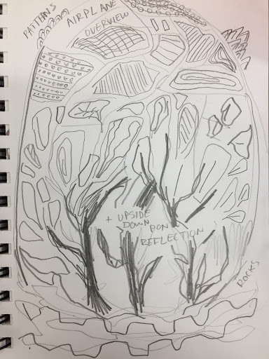
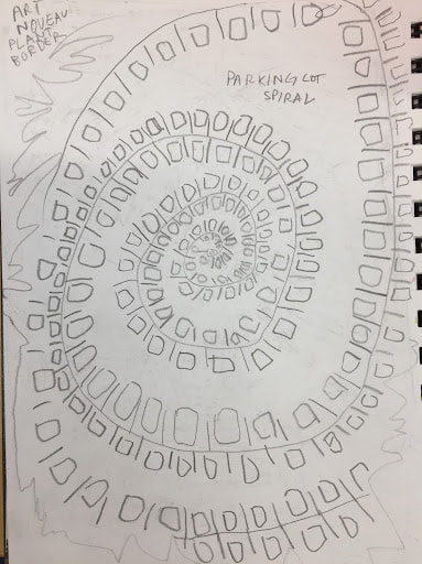
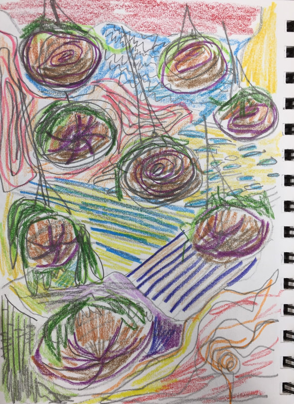
The piece is carefully and thoughtfully executed. The lines are often bumpy, but this was a purposeful decision to enhance the organic quality of the shapes.The unevenness is carefully defined with sharp edges so as to look neat despite the irregularity. Also, a lot of planning went into the use of color in this piece. I worked with many layers of paint. This was not just to make sure I had fully covered the canvas, but also in order to create temperature and tone in different areas of the piece. For example, I used red to create an underpainting for the plants, a color that still shines through at the borders of leaves and between regions of blue in the hanging basket. I made sure to go back with a smaller brush in order to more clearly define the edges of different regions of color, as well as to add another coat of paint where it was necessary. I am proud of the craftsmanship of this piece. 2. How does your work embody the artist’s style? Much like in Hundertwasser’s work, I used bright, saturated colors and little-to-no shading/highlighting. Everything appears flat. All shapes in the painting are the same distance from the viewer, as I purposefully did not use perspective. Also, there are no perfectly straight lines. Even in areas where the lines tended to be less curved, I still created some irregularities to keep the shapes organic. I made use of multiple swirls and spirals in the piece to keep it organic. The hanging baskets are spiral shaped, but there are also spirals in the background at the top (in the pink/blue region) and the bottom (in the yellow/red region). I used very few aspects of Klimt’s art, as his dark, muted color palette and tendency to subtler depictions of light would not have worked for this piece. However, I did make use of metallic colors (which Klimt used for embellishment) in the outlines of the plants. 3. Describe your choice of colors/color harmonies and how you used them throughout the artwork. I used a very broad range of colors in the piece. Some of the colors were inspired by my reference photos. The top right red/yellow/green region was based on the appearance of farms and fields as viewed from a plane, so the colors reflect various stages of harvest. I did exaggerate the colors somewhat (particularly the red) to use brighter colors in place of neutral brown. Other colors were not found in any reference photos for this piece. I planned the colors using Prismacolor pencils in my sketchbook, so I was actually inspired by the pencils themselves. For example, I really liked the appearance of the peach, pink, and dark blue pencils together. This is what inspired me to use those colors for the striped region. Also, I wanted to experiment with using layers of different colors to create more detail. This shines through in the blue/green areas of the bottom left (resulting from the background being painted blue) as well as the flecks of red in the hanging baskets. 4. What is the emphasis (focal point) of your artwork? I tried to make the hanging baskets the focal point of the piece. I did this by using a variety of different colors, since I know the eye is often drawn to the areas of greatest contrast. I changed the colors for the baskets themselves from brown (in the reference photo) to blue, red, and purple. This is because I wanted to create an eye-catching effect with the saturation. I also used the complementary colors red and green to accentuate the plants themselves. When I was painting, I began to notice that the bottom right corner was a very dominant region, as I had worked the most on that area, and because red and yellow are very eye-catching colors. I was worried that the hanging baskets would fade into the background. This is why I chose to outline them with silver. The silver’s color-changing metallic properties create visual interest and draw the eye when every other color is static. 5. How did you use textures and patterns to embellish your artwork? I used a wide variety of textures and patterns. My personal favorite is actually the crescent-shaped embellishment in yellow and blue on the bottom left. I wanted to create visual interest in this region, so I had an invert-color effect, carefully painting yellow only on the blue background and blue only on the yellow background. This allows the different colors to pop, as well as creating an almost shiny appearance. The other clear example of patterned embellishment was the line of bright green dots along the orange stripe across the middle of the painting. This line of dots was not actually something I had planned originally. I had mixed a batch of bright lime green to use for the plants, and I overestimated how much I needed. The result was that I had excess bright green paint. Bright green is one of my favorite colors, so I didn’t want to just throw it away, especially since I knew there was not much else in my color plan that included lime green. I used this line of dots to include more of a color I really enjoyed, but also to create some pattern and visual interest in an otherwise flat area. I really like how the green breaks up the orange. 6. How did you put a border on your artwork? How does it enhance the work? I did not use a border or frame around the outside of the piece. However, the warm, swirly region in the bottom right corner does provide some framing for the piece. Additionally, I did outline various objects in the piece. Particularly, the blue/yellow and pink/indigo striped regions in the background, representing crop fields, are outlined. The outlines were also important in the top right red/yellow/green area, where they were used to separate the flat areas of color while still maintaining some unity in the patterns. 7. Describe any difficulties you had creating this artwork. I haven’t worked with acrylics for a long time. Going into this project, I had the impression that they are bright, opaque, and creamy. This is true to some extent: they are certainly bright and saturated, and the texture is much thicker than watercolor with no bumps or granules. However, I was surprised at how little opaque coverage some of the pigments– especially the warm blue– provided. The bright, thick indigo was something I was hoping to use in my piece, particularly as an outline color. If I were to continue to use acrylics, I would paint a base of darker colors and use creamier, lighter colors on top to fully take advantage of the opacity. 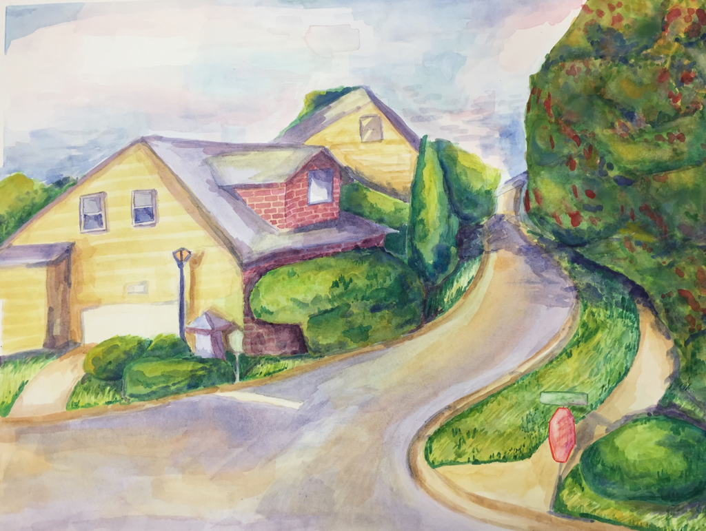 Final piece
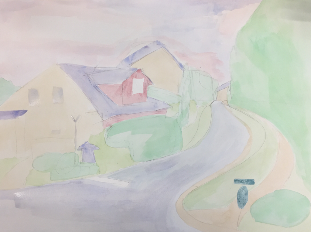
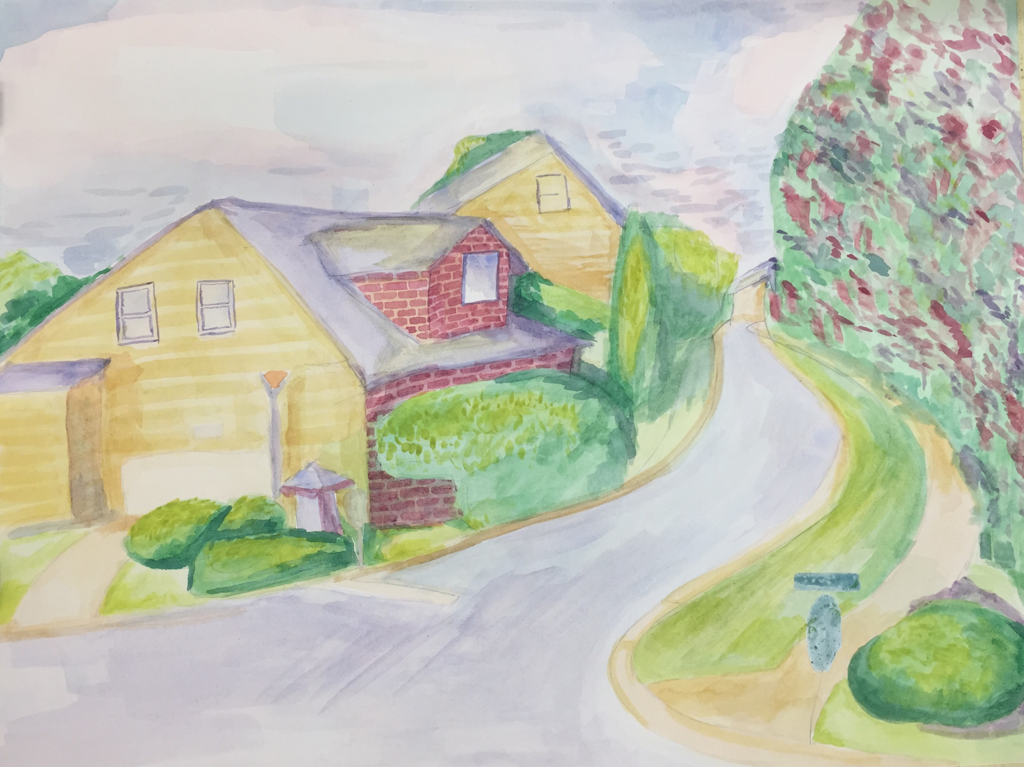
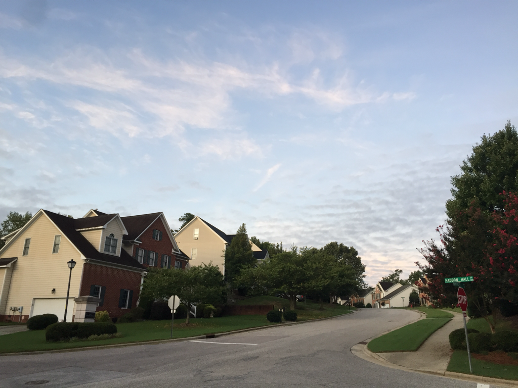
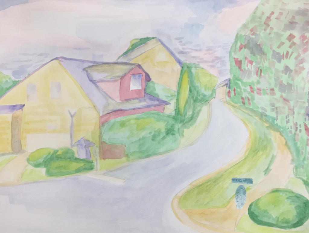
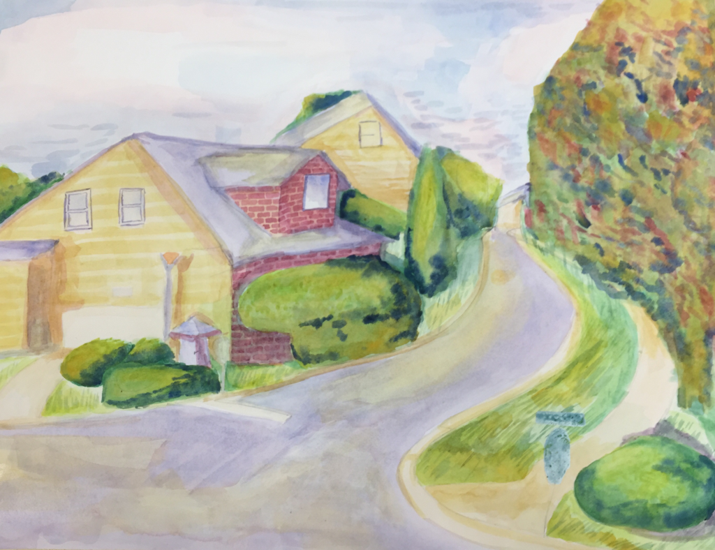
1. What watercolor techniques proved to be effective in your painting? How and Why?
When I started the painting, my preferred technique was to layer only one color of paint at a time, wait for that layer to dry, then add another layer. This wet-on-dry technique helped with the boxy, sharp shapes and textures of the houses, but did not work very well for the foliage. Instead, a wet-on-wet technique was much better, adding organic shapes and layers of natural-looking shadow. My blend of wet-on-dry and wet-on-wet techniques to create different textures were effective. 2. How important was using transparent layers in your painting? The use of transparent layers was very important. Most notably, I used it to create the glowing sunlight effect as well as the drop shadows for the trees. The gradual buildup of color creates depth and complexity in even something as simple as an asphalt road, creating visual interest in an otherwise bland area. It allowed me to let the edges of light and shadow blend together without creating muddiness. 3. Explain how your composition was successful? Did you utilize all the elements of art and principles of design? Explain. My piece shows all elements and principles of design. Line can be seen in the use of the road to create the broad structure of the piece. This is also a demonstration of shape, space, balance, and emphasis: the curved shape as the street moves into the distance creates a dynamic flow in the piece, drawing the audience’s eye along the road. The way the street shrinks as it gets further away from the eye is an example of perspective, showing space and depth, as well as keeping near objects in proportion with far objects. Also, the street splits the piece into two parts: the larger left side with paler colors and mostly artificial structures, and the darker, smaller, more organic right side. The two sides are in balance because neither appears more important than the other, despite (or because of) the difference in space and color. I used different values, from almost pure white in the sky to deep blue in the trees, to indicate light and shadow, as well as using warm yellow and cool purple to indicate the same. I used different techniques to achieve the contrasting leafy/organic texture of the trees, the sharp and fluffy texture of the grass, the smooth texture of the road, and the boxy, manmade textures of the houses. However, the piece still ends up unified, because of its limited color scheme and consistent lighting. 4. Was color choice an important factor in the overall success of the painting? Why? Color choice is one of my favorite things about my painting. I definitely changed the colors from the original photo, adding a warmer yellow light and purple shading. I also brightened the plants considerably. The original cold palette of the photograph created an atmosphere of loneliness, whereas the warmer palette I chose was much more cheerful. 5. Describe your craftsmanship. I put a lot of care into this piece. I used broad brushstrokes to wash the background with color, then took time to build up the basic shapes in the composition. The fine detail in the bricks and grass took time, but it was ultimately worth it. 6. If you were able to do something different, what would it be and why? I would repaint the tree on the right. When I began painting, I did not have a good idea of how to create foliage, and my underpainting for that tree was pale green with red and purple squared-off patches. As I continued, I learned that a better technique would have been to begin with a warm yellow instead, and a better way to block out areas for where the flowers would go would be to use a wet-on-wet technique to add the red. My heavy-handed application of green and red in the beginning forced me to darken (and muddy) the entire tree in order to even get some indication of light and shadow. Next time, I would be more cautious and conservative with the paint in the beginning, making the tree closer in appearance to the other foliage in the piece. 7. Explain to me what you have learned about watercolor and how it has improved or discouraged your development in art. I did not know that I enjoyed watercolor before this unit. I learned that it is still possible to get vibrant colors with some patience, even though the medium itself is suited to pale colors. I have learned to love the meditative quality of creating layers of light and shadow on a paper in a way that I hadn’t previously. My development in art has improved because of this. I have even created a couple pieces at home on my own time, in addition to the extra piece I created in class after finishing this one.

|